Bob Sander
Mar 4, 2026
How to build a responsive hero section in 5 minutes
How to Build a Responsive Hero Section in 5 Minutes
In the old workflow, building a hero section meant designing it in Figma, then spent hours wrestling with CSS media queries to make it look "okay" on mobile.
In Koda, we do things differently. Here is how to build a production-ready, responsive hero section using Logic-Driven Layout.
Step 1: Set your canvas logic
Instead of drawing a box, start by defining your Container. The Action: Select the Section tool and set your layout to Flex.
The Insight: By choosing Flex logic from the start, Koda knows how to stack your elements before you even add them. No more absolute positioning "ghosts."
Step 2: Use design tokens for consistency
Don't guess your hex codes.
The Action: Apply your Background-Primary and Text-Heading tokens.
The Insight: Because these are synced to your CSS variables, if you decide to change your brand purple later, this hero section will update automatically across your entire codebase.
Step 3: Defining responsive behavior
This is where the magic happens. We don't use rigid breakpoints; we use Auto-Flow.
The Action: Set your main container to Flex-Wrap.
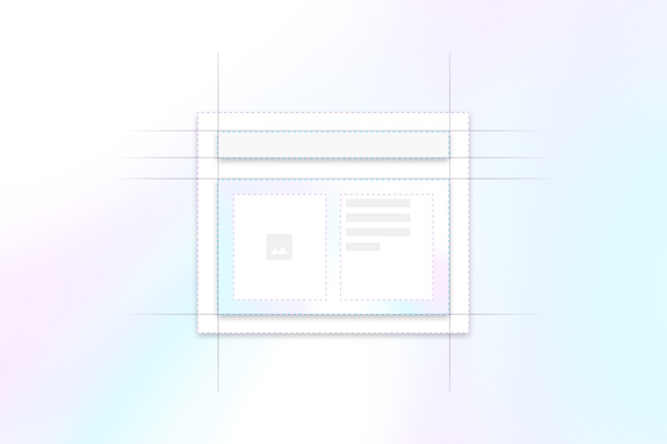
The Insight: On a desktop, your headline and image sit side-by-side. As the screen narrows, the image will naturally "flow" beneath the text. Koda generates the flex-wrap: wrap; CSS for you instantly.
Step 4: The "clean code" check
Before you finish, peek at the code panel.
The Action: Toggle the Code View at the bottom of the canvas.
The Insight: Notice the lack of "Div-Soup." You'll see a clean <section> containing an <h1> and an <img>. It’s the exact code you’d write by hand—only faster.
Step 5: Instant export
The vision is locked. Now, take it to your app.
The Action: Hit Export and choose Tailwind Components.
The Insight: Copy the generated code and paste it directly into your React or Next.js project. It’s live, it’s responsive, and it’s done.
Start building
Start shipping faster today
Turn your designs into production ready code in minutes — not days.